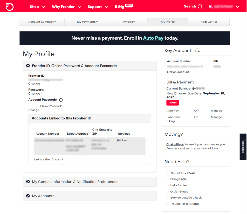
Account dashboard: Before
The account dashboard was cluttered and disjointed, with inconsistent fonts, poor hierarchy, and no clear structure—making information hard to scan and navigate. A lack of personalization and off-brand tone created a cold, unwelcoming experience.
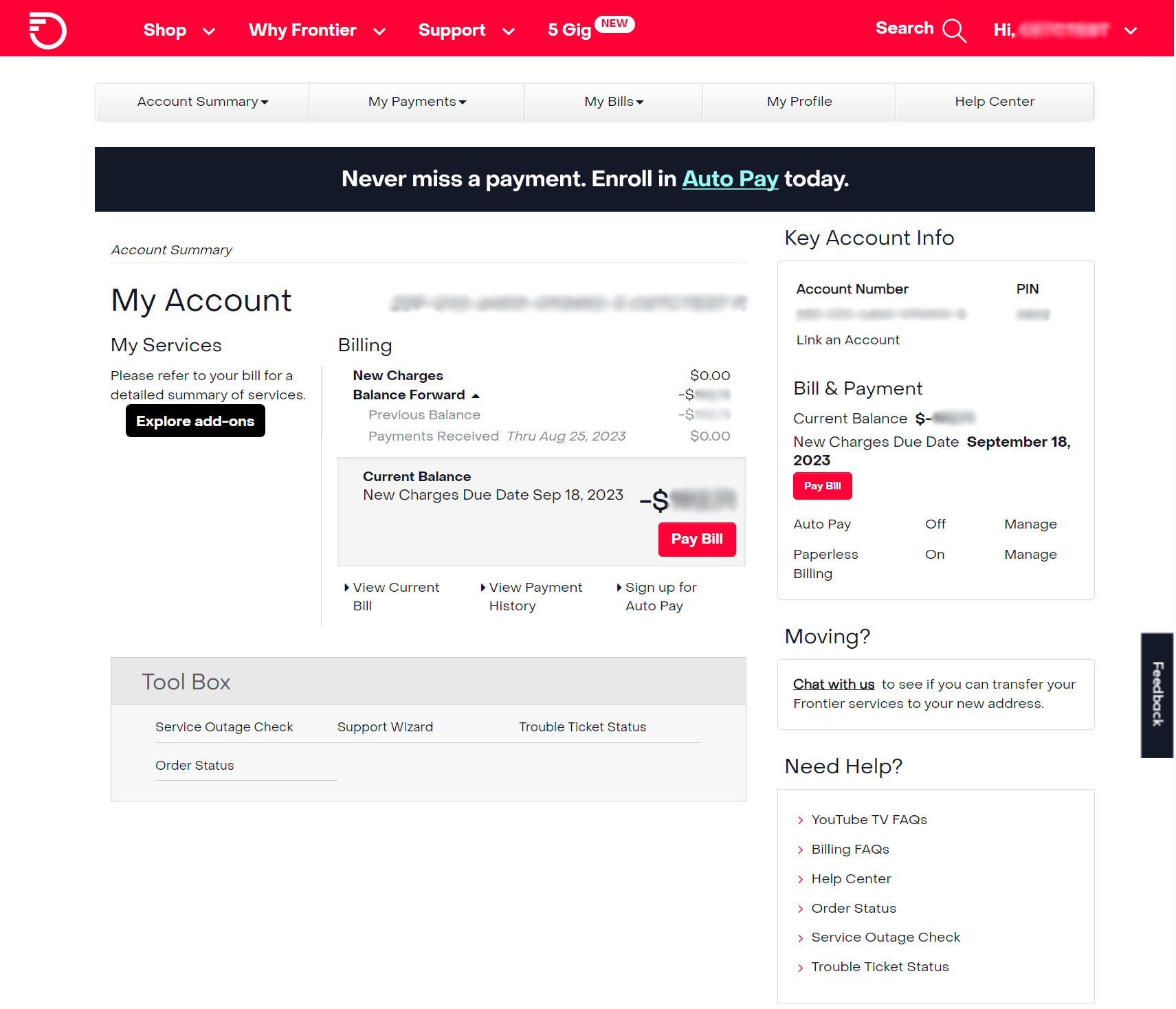
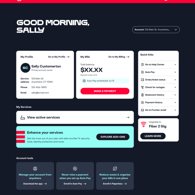
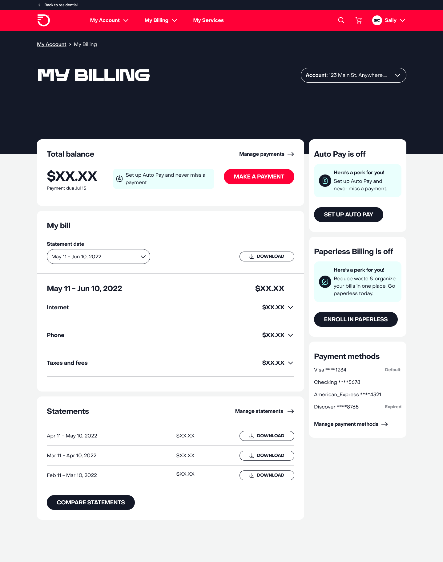
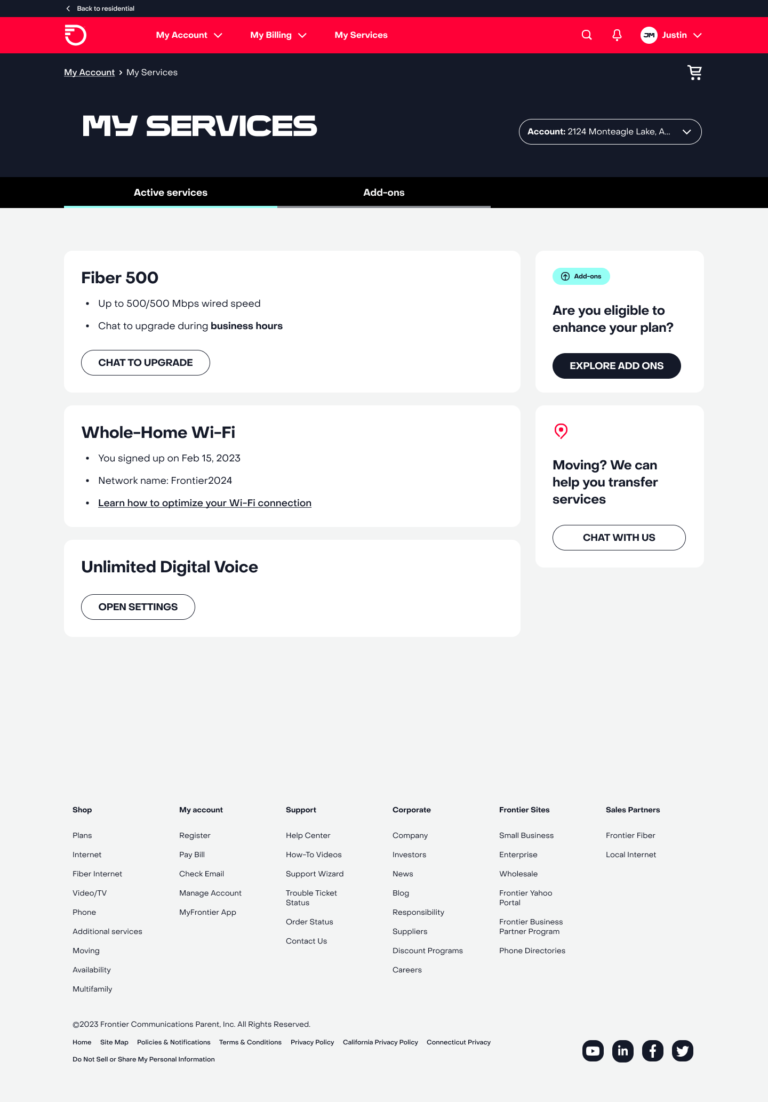
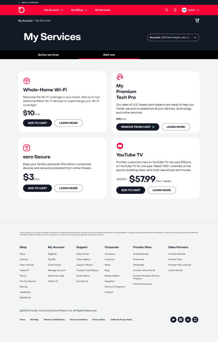
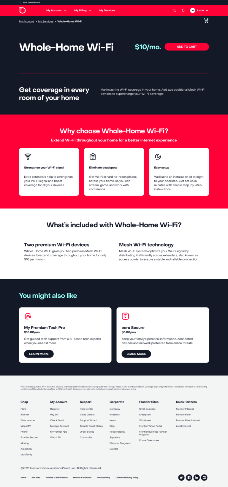
Account dashboard: After
We introduced a personalized greeting and clearer headings to make key account details easy to find at a glance. Consistent fonts, spacing, icons, and colors improved scannability, reduced cognitive load, and created a friendlier, brand-aligned experience.